Project 1: Expository Visualization
Table of contents
An expository article requires the author to investigate an idea, evaluate evidence, expound on the idea, and set forth an argument concerning that idea in a clear and concise manner.
In this assignment, you will design an expository visualization to clearly communicate an idea based on a small data set. In addition, you must provide a rigorous rationale for your design choices. You should in theory be ready to explain the contribution of every pixel in the display towards your expository goals. You are free to use any graphics or charting tool you please - including matplotlib, Plotly, Tableau, and pen and paper.
Data: Grocery Store Foods
The foods stocked by grocery stores strongly influences consumer decisions and dietary health. Here, you will examine a dataset of over 50,000 food items sold by Walmart, Target, and Whole Foods that categorizes items based on their degree of processing, price range, and nutritional content.
The dataset can be downloaded here.
The data has the following columns:
name: The name of the food product.store: The store where the product is sold (Walmart, Target, or Whole Foods).category: The food category of the product.brand: The brand of the product.FPro: The Food Processing Score, a value between 0 (minimally processed) to 1 (highly processed), as calculated by the GroceryDB authors using a random forest model.FPro_class: The predicted NOVA classification for the food. 0 = Unprocessed or minimally processed foods; 1 = Processed culinary ingredients, 2 = Processed foods, 3 = Ultra-processed food and drink products.price: The price of the product.price percal: The price per calorie.package_weight: The weight of the package in grams.Protein: Protein content.Total Fat: Total fat content.Carbohydrate: Carbohydrate content.Sugars, total: Total sugar content.Fiber, total dietary: Dietary fiber content.Sodium: Sodium content.Cholesterol: Cholesterol content.
The nutrition data (protein, fat, carbs, sugar, fiber, sodium, and cholesterol) is normalized to grams per 100g of product.
This dataset is a simplified version of the GroceryDB dataset, which was originally developed to make information about food processing accessible and to guide consumers toward less processed food choices. More information about the dataset can be found in their Nature Food paper. You might also find their website TrueFood.Tech helpful. For more information on the NOVA classification system, see pages 4-6 of the NOVA paper.
A Note on Data Quality:
This is a real-world dataset, and like many, it is not perfect. You will encounter data quality issues, including extreme outliers, missing values, and other inconsistencies.
Part of your task is to think like a data scientist. When you encounter these issues, you should make (and document) reasonable assumptions about how to handle them for your analysis. Your rationale for these decisions is a required component of your write-up.
Task
Your task is to design a single static (i.e., single image) visualization that you believe effectively communicates an idea about the data, and provide a short write-up (no more than 4 paragraphs) describing your design. Start by choosing one important takeaway you’d like the readers of your visualization to learn. Design your visualization to persuade readers of that takeaway, and use the takeaway as the title of your graphic.
While you must use the data set given, you are free to transform the data as you see fit. Such transforms may include (but are not limited to) log transformation, computing percentages or averages, grouping elements into new categories, or removing unnecessary variables or records. You are also free to incorporate additional external data. Your chart image should be interpretable without needing to reference your write-up. Do not forget to include title, axis labels, or legends as needed!
As different visualizations can emphasize different aspects of a data set, your write-up should document what aspects of the data you are attempting to most effectively communicate. In short, what story are you trying to tell? Just as important, also note which aspects of the data might be obscured due to your visualization design.
Your write-up should provide a rigorous rationale for your design decisions. Document the visual encodings you used and why they are appropriate for the data and your specific question. These decisions include the choice of visualization type, size, color, scale, and other visual elements, as well as the use of sorting or other data transformations. How do these decisions facilitate effective communication?
Grading
The assignment score is out of a maximum of 10 points. The expected median score on this assignment is an 8.5, which corresponds to an A-. We will determine scores by judging both the soundness of your design and the quality of the write-up. We will also look for consideration of audience, message, and intended task. Here are examples of aspects that may lead to point deductions:
- Use of misleading, unnecessary, or unmotivated graphic elements.
- Missing chart title, axis labels, or data transformation description.
- Missing or incomplete design rationale in write-up.
- Ineffective encodings for your stated goal (e.g., distracting colors, improper data transformation).
Your project will get 8.5/10 points if you fulfill all the requirements in the project description. You’ll get higher than 8.5 points if you go above and beyond the project requirements, up to 10 points. We’ll possibly give even higher than 10 points if the work is truly exceptional (e.g. could be published in a popular news article). From our perspective, the project description tells you how to get a passing grade on the project — if you followed the description and published your work as part of a portfolio, it would be considered good quality work by an outside reviewer (e.g. a professional data scientist), but probably wouldn’t be outstanding or memorable. Getting a 8.5/10 on the project grade reflects that.
Projects that go “above and beyond” the assignment requirements to produce effective graphics may include, for example, outstanding visual design, meaningful incorporation of external data to reveal important trends, exceptional creativity, or effective annotations and other narrative devices.
Rubric
The assignment is out of 10 points possible. Submissions that squarely meet the project requirements (Satisfactory column) will get 8.5/10 points.
| Component | Excellent | Satisfactory | Not Satisfactory |
|---|---|---|---|
| Visual Encodings | The visualization does not violate the expressiveness criteria and the design choices (marks and encoding channels) are clear, evocative, and effective. (+4 points) | The visualization does not violate the expressiveness criteria, but another set of design choices (marks and encoding channels) could have been more effective (e.g. using the area visual channel instead of position when possible). (+3 points) | The visualization violates the expressiveness criteria (e.g. heavy overplotting, encodings that imply incorrect readings, etc.). (+2 points) |
| Annotations | In addition to the Satisfactory requirements, the plot contains appropriate and helpful annotations (e.g. text, coloring, shading) that draw the reader’s attention to the most relevant parts of the data. (+2.5 points) | The plot’s title contains an interesting research question or takeaway; the axes have clear, human-readable labels with units; and a legend is present if appropriate. (+2 points) | One or more of the required annotations are missing (e.g. a title that describes the plot rather than an interesting takeaway, axes use auto-generated labels from data columns, etc.). (+1 points) |
| Data Transformations | The visualization uses appropriate data transformations (e.g. filtering, aggregating) and describes the transformations to the reader (e.g. in the subtitle of the plot), In addition, it clearly and explicitly describes the transformations to the reader (e.g. in the subtitle of the plot). (+1.5 points) | The visualization used an inappropriate set of data transformations (e.g. filtering out important outliers), or did not clearly describe these transformations to the reader. (+1 point) | |
| Writeup | The writeup clearly describes the motivation for the visualization and the rationale for its design decisions (e.g. the visual encodings, data transformations, color palette, etc.). It also contains an overview of the development process. (+2 points) | One or more required elements of the writeup has major issues (e.g. rationale misses important parts of the visualization design) or is missing. (+1 points) | |
| Creativity and Originality | The submission exceeds the assignment requirements, with original insights or particularly engaging visualizations. (up to +1 bonus point) | The submission meets the assignment requirements. (+0 points) |
Submission Details
This is an individual assignment. You may not work in groups. There is a checkpoint submission due on Tue 10/7, by 11:59pm. Your completed assignment is due on Tue 10/14, by 11:59pm.
Checkpoint Submission
You must submit your assignment using Gradescope. Please upload a single PDF with the following:
- 3 plots that you are considering for your project
- 1 paragraph describing which plot you prefer the most and why
Final Submission
You must submit your assignment using Gradescope. Please upload a PDF with a single image of your visualization design and your write-up, in two separate pages.
Be sure your image is sized for a reasonable viewing experience! Viewers should not have to zoom or scroll in order to effectively view your submission. Ensure that the content of your write-up follows the instructions above. Do not include your name or PID in the filename!
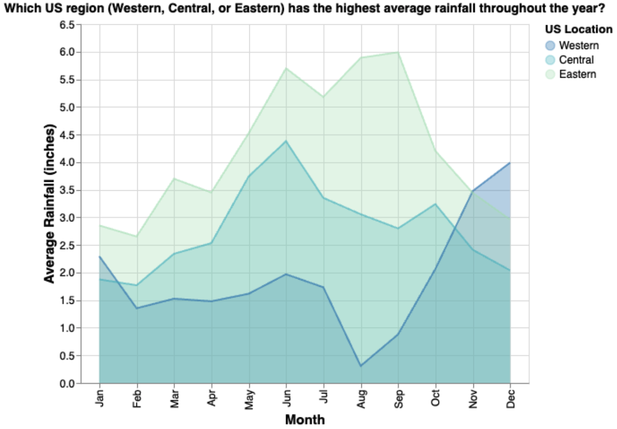
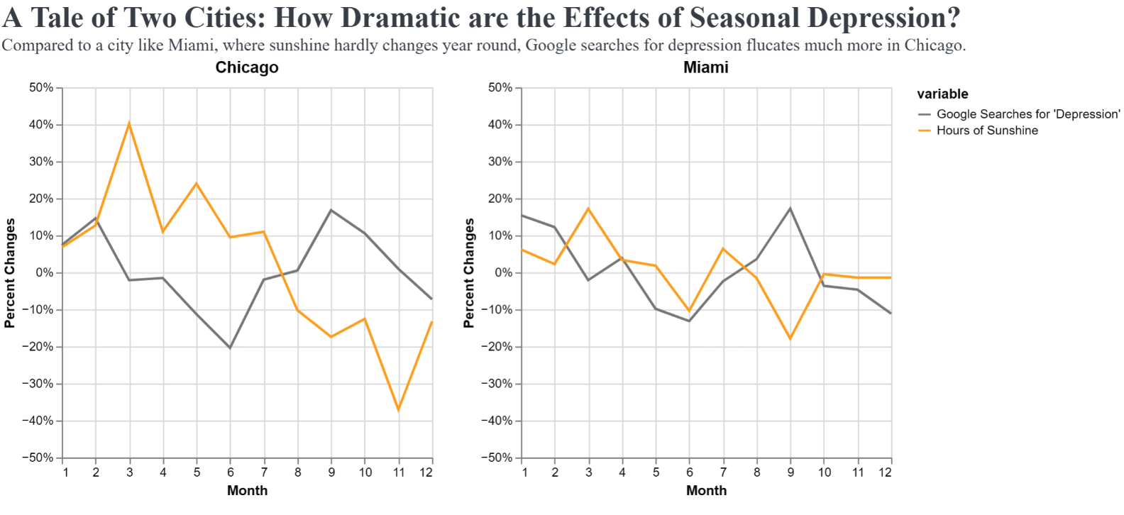
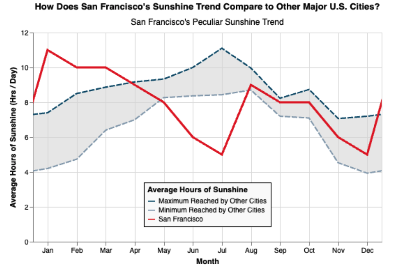
Inspiration (Past Project 1 Best Project Awards)
To inspire more creative ideas for your Project 1, we’ve included a few Project 1 submissions from previous quarters (that used a dataset about weather) that were especially effective, insightful, or creative.
Acknowledgements
The design of this project is largely based on a similar assignment from Arvind Satyanarayan from MIT and Jeffrey Heer at the University of Washington.